Logo & branding / Beauty
Noor
An identity with a softer kind of presence.
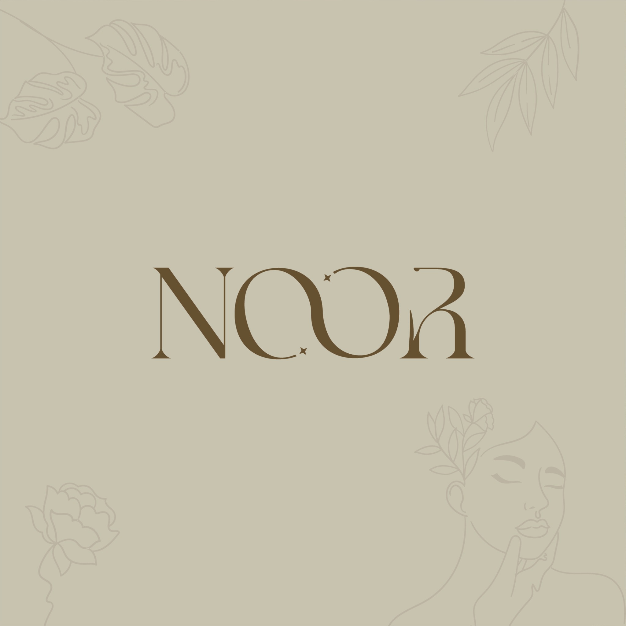
A beauty identity shaped by expressive lettering, botanical detail and a warm, considered palette. From the wordmark to packaging applications, every element speaks the same visual language.
- Client
- Noor
- Industry
- Beauty & skincare
- Services
- Logo & branding · Art direction · Packaging applications
The starting point
The brief.
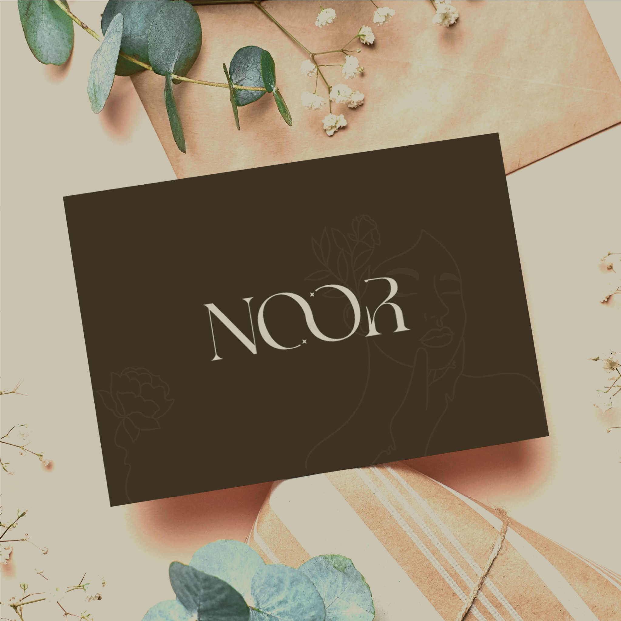
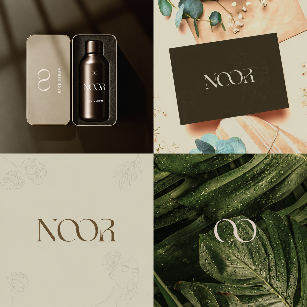
The Noor identity brings together a distinctive wordmark, a compact monogram and a visual language for beauty applications. The supplied design presentation shows the system across a branded card and a face serum packaging mockup, with botanical imagery connecting the different expressions.
The direction
Our approach.
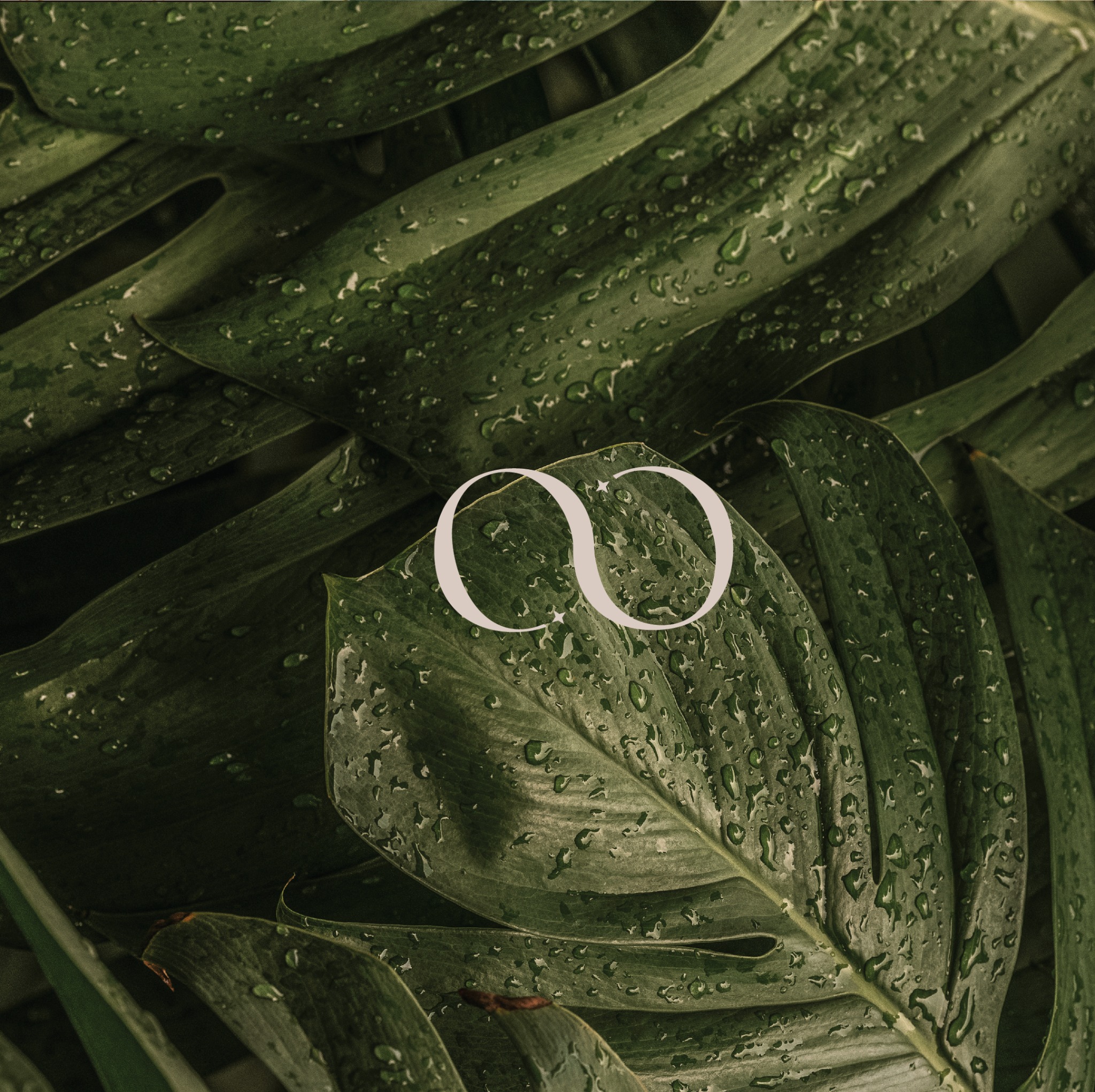
The flowing letterforms give the Noor wordmark its character. Interlocking circular forms become a compact monogram, while small star details add a delicate point of recognition. Warm neutrals, deep brown tones and botanical textures create a calm setting for the identity. Fine portrait and plant illustrations support the design without competing with the name.
The work
Every detail, connected.
A connected logo and branding presentation: the full wordmark leads the communication, the monogram works as a smaller signature, and the supporting illustration and palette carry through the supplied card and serum mockups.
- Noor wordmark
- Interlocking monogram
- Brand colour and illustration direction
- Branded card mockup
- Face serum packaging mockup
Applications shown are design mockups from the supplied brand presentation.
Have a project in mind?
Let’s shape your next chapter.
Tell us about your business, your audience and what you want to create.
Discuss your project