
Food & Beverage / Logo and Packaging
Tea & Tropics
Full of Flavour.
Distinct by Design.
Logo and pouch packaging for dried fruits and matcha, bringing vibrant tropical flavours and a fresh tea ritual into one recognisable brand.
- Client
- Tea & Tropics
- Range
- Dried Fruits & Matcha
- Services
- Logo and Brand Identity · Pouch Packaging · Product Range Design
The Brief
Bring Two Product Worlds Together.
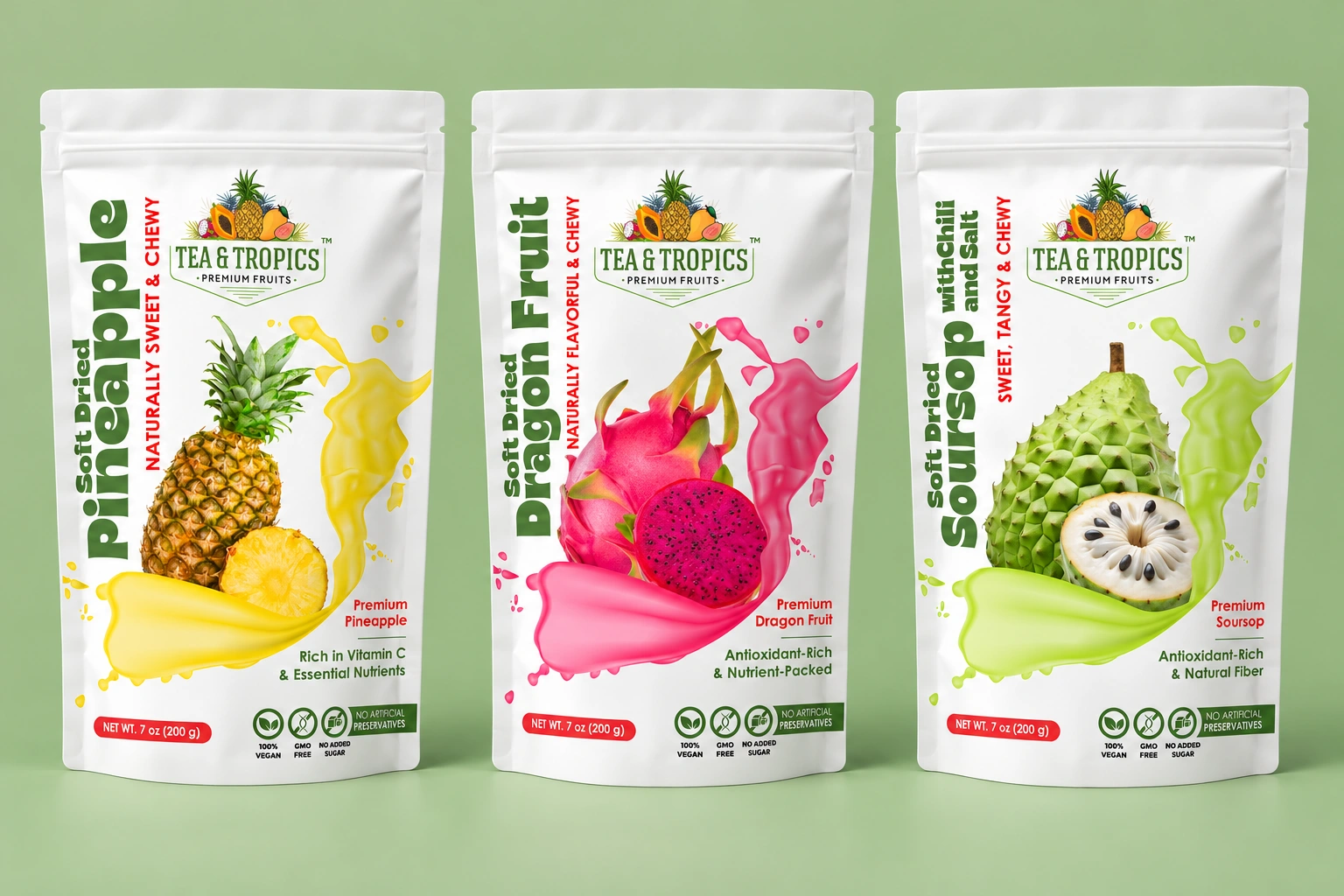
Tea & Tropics needed a logo and packaging that could connect tropical dried fruits with matcha. Each product needed a distinct presence, while the collection had to be immediately recognisable as one brand.
Working with content supplied by the client, we planned the visual identity and packaging layouts. The aim was a clear, appealing system that could celebrate different flavours without losing its shared signature.
The Approach
Lead With Colour. Connect Through Identity.
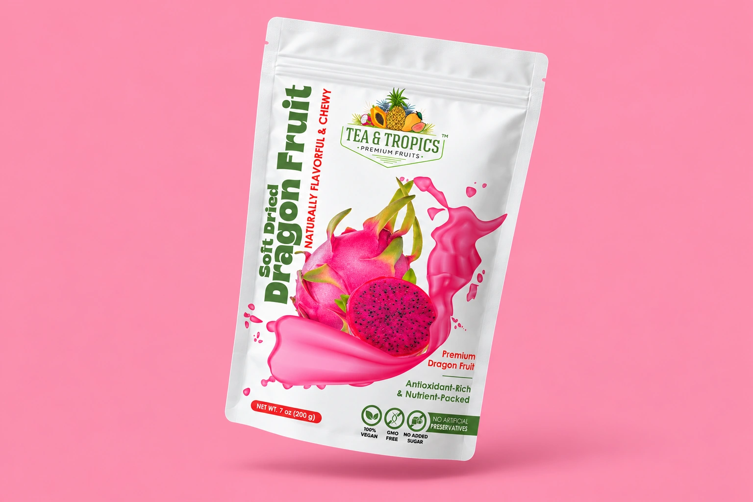
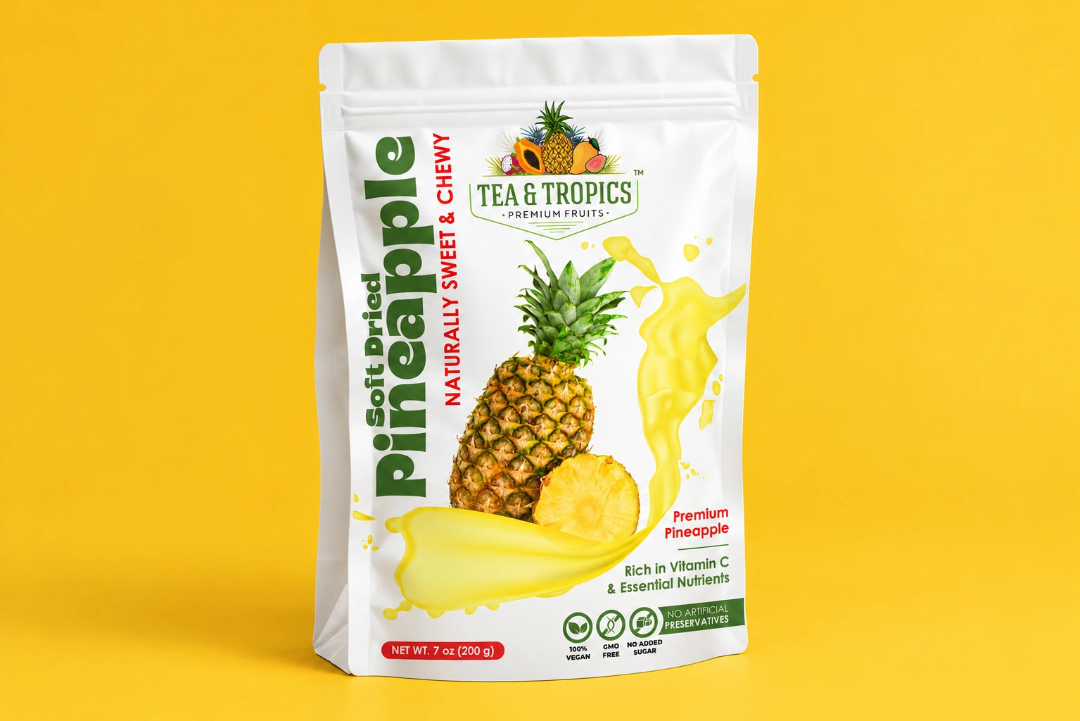
A fruit crest and green wordmark give every pouch a consistent point of recognition. Across the dried-fruit range, prominent fruit imagery, vertical product names and vivid splashes create an energetic expression of flavour.
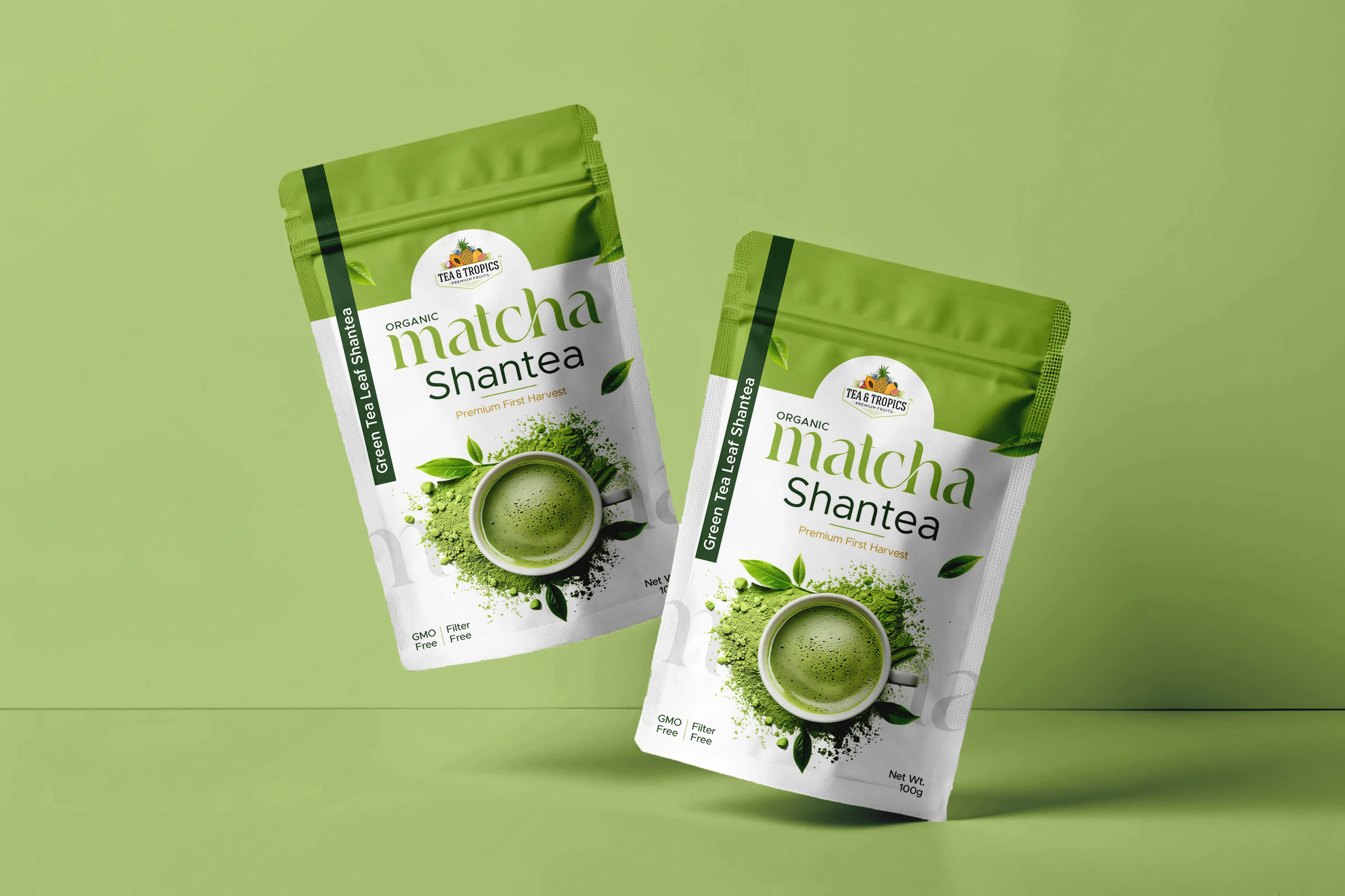
Matcha takes a quieter direction through layered greens, tea imagery and contrasting typography. The treatment changes with the product, while the brand identity holds the collection together.
The Collection
Individual Character. Shared Recognition.
Pineapple, dragon fruit and soursop each have their own colour and ingredient cues. The consistent logo placement and information hierarchy help customers recognise the brand and distinguish between products.
The matcha packaging extends the identity into a different category without simply repeating the fruit designs. These images are packaging presentation mockups, showing the artwork on pouches rather than photographs of manufactured packs.
The Deliverables
From Brand Mark to Pouch.
The project brought logo design and packaging execution into one connected visual system, balancing a recognisable brand with product-specific expression.
- Logo and brand identity design
- Packaging planning using client-supplied content
- Dried-fruit pouch designs
- Matcha pouch design
- Coordinated product range presentation
Have a project in mind?
Let’s shape your next chapter.
Tell us about your business, your audience and what you want to create.
Discuss your project