
Retail / Shopfront Signage
Clyde Fruits
and Veggies
Fresh From
Every Angle.
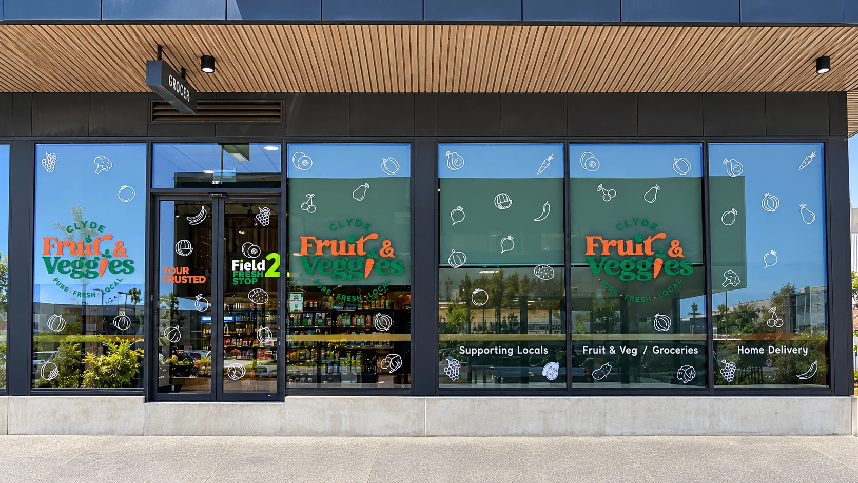
A three-sided shopfront brought together through bold brand signage, fresh produce graphics and carefully placed window details. Approximately 50 m² of work for a local grocer in Clyde North.
- Client
- Clyde Fruits and Veggies
- Scope
- 3 Shopfront Faces · Approx. 50 m²
- Location
- Shop 1, Matterhorn Dr
Clyde North VIC 3978
The Brief
Make the Whole Store Feel Connected.
With glazing across three sides, the store needed more than a single sign above the entrance. Each frontage had to identify the business clearly and carry the same welcoming character as customers approached from different directions.
The challenge was to work across approximately 50 m² while respecting doors, window frames and sightlines. The signage needed to communicate fresh produce at a glance without losing the openness of the shopfront.
The Approach
Bold at a Distance.
Considered Up Close.
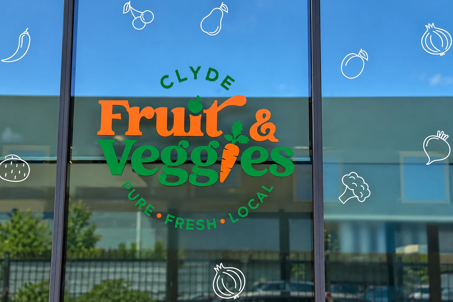
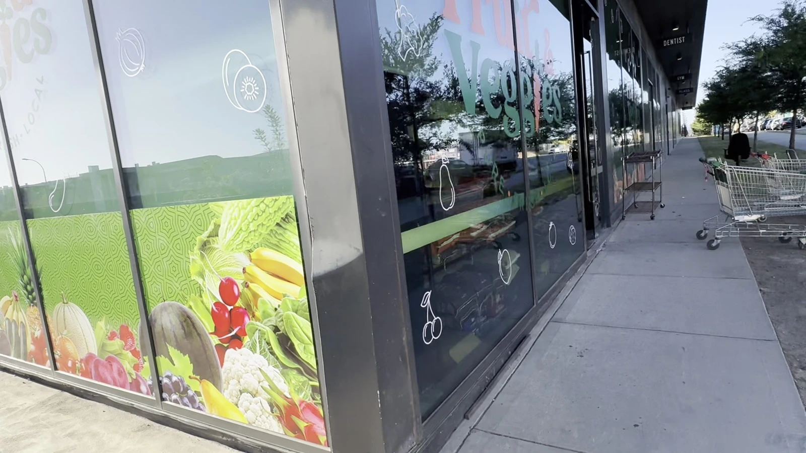
Large orange and green brand marks provide the main points of recognition. Around them, white fruit and vegetable illustrations add detail while leaving space for the glass and the store beyond it.
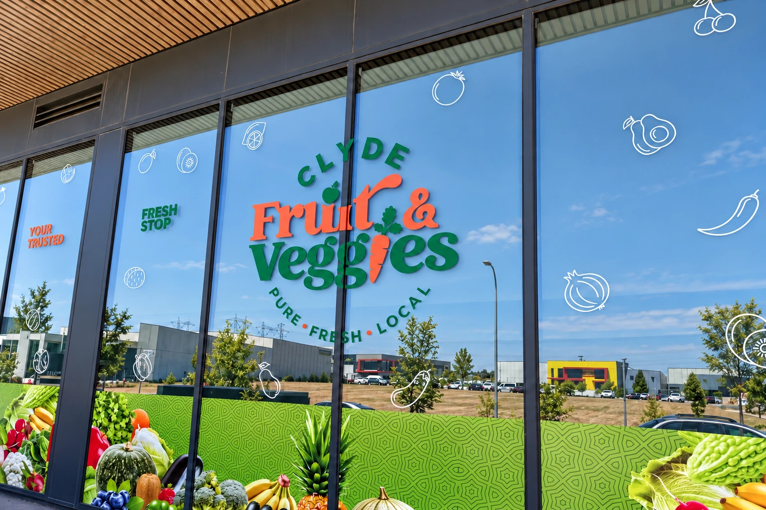
Along the side windows, a vivid green base and colourful produce imagery create a continuous visual band. The graphics follow the rhythm of the glazing, connecting individual panels into one recognisable frontage.
The Installation
Three Sides. One Local Identity.
The front elevation centres on the entrance and store name, with supporting messages positioned lower on the glazing. The side elevations carry the identity around the building, combining oversized brand marks with the produce-led graphic band.
These selected angles from the on-site footage show how the design sits within the actual shopfront, from the entrance to the corner return.
In Motion
Walk Around the Finished Work.
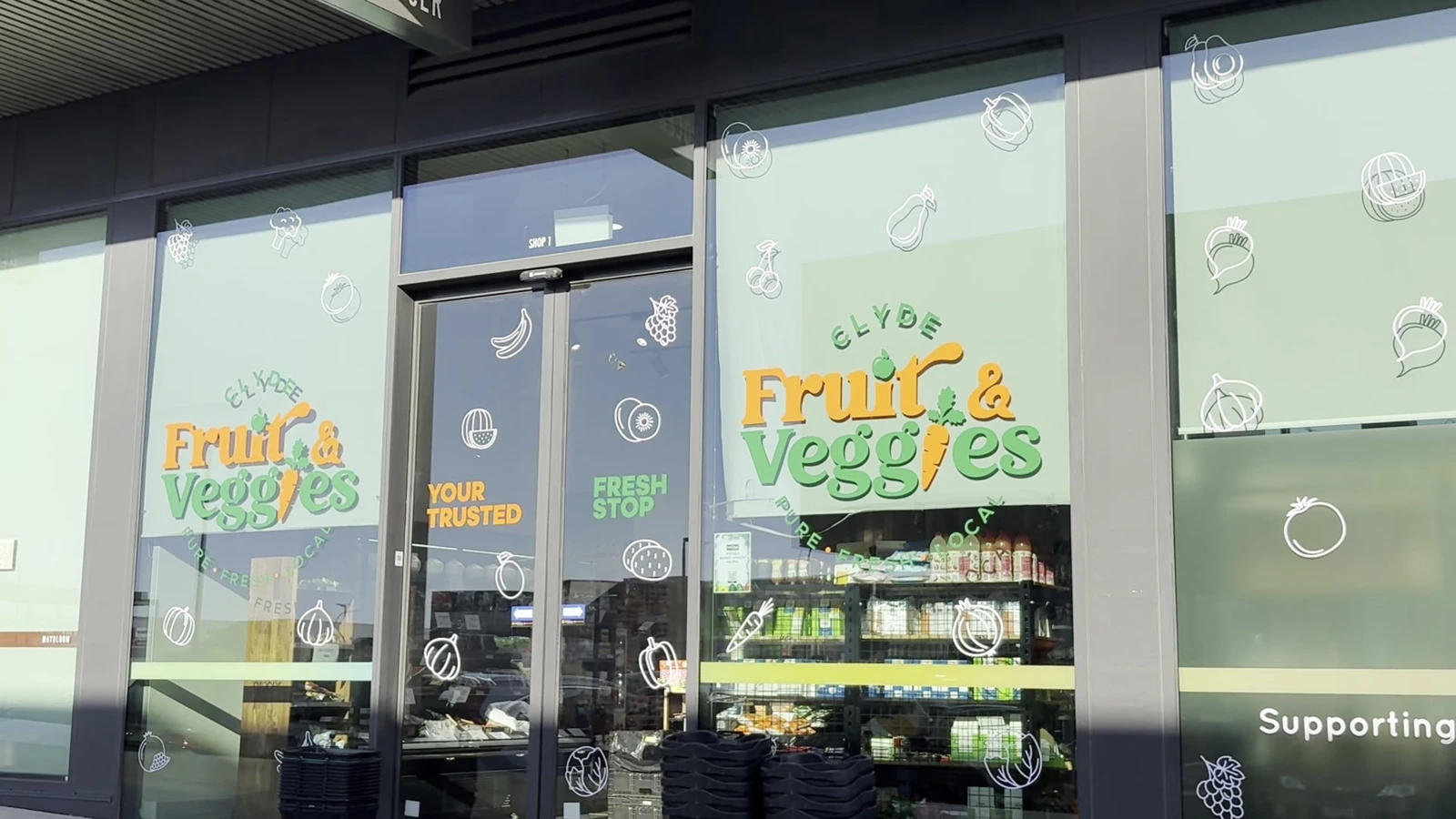
Two short on-site films show the scale, finish and relationship between the different elevations. Follow the front windows, then move along the side frontage to see how the graphics carry around the store.
The Outcome
A Shopfront With a Clear Sense of Place.
A connected retail presence that makes the store recognisable from multiple approaches. Bold lettering, produce imagery and smaller window details each play a distinct role, bringing the three shopfront faces together.
Project scope: shopfront signage, window branding, produce graphics and supporting retail messages across approximately 50 m².
Have a project in mind?
Let’s shape your next chapter.
Tell us about your business, your audience and what you want to create.
Discuss your project